A poster advertising my film
After analysing other film posters and carrying out my audience research, I learnt that conventionally the most important features of film posters were the films logo and title, effective images/photographs and the pictures release date.
On my own film poster I decided to use four separate images of each of the main characters in my film. I then edited out the backgrounds of these images and placed each one in a separate coloured box. I adopted this style from the film poster for the 2007 film "Hairspray". I believe that this technique looks very effective on my product because it establishes an identity for each of the characters, as each is positioned in their own unique pose. The bright colours are also very eye-catching and I believe make my poster look very attractive. I also used a gradient effect on these colours, making them fade out from a white centre and gradually getting darker as they spread towards the edges of the box. I thought that this effect replicated a stage spotlight, iconic to films musical genre, and created a halo effect around the characters making them look dominating and of real importance. I also wanted the colours to represent the role of the character in the film, for example I chose to have the two girls against red and orange backgrounds as these colours connote danger and evil, and also reflect the girls' fiery, competitive natures. I placed the male on the far right against a blue background to reflect his strong masculine pose, and his determined nature in the film. The other male character however is much more reserved and less confident in my trailer, often seen needing the encouragement of his friend to stick with the competition. I therefore placed him against a green background to reflect his placid, more reserved nature.
I wanted the way the characters were represented in the photographs to reflect the film's title "Believe", so I positioned them in stances which made them appear strong and confident. I had the two male characters looking up and took the photos from a low angle to make them look dominating and in control, whilst I had the two girls holding strong, elegant dance poses, which also reflect the film's genre as a musical. Above the photographs I have chosen to show the names of each of the actors in my film in a bold white font so that they stand out against the brightly coloured backgrounds. I chose to show this information as conventionally the names of the main actors in the film are shown on most film posters, and on my poll some of the voters some of the voters revealed that they felt it was important to show this information of the product.
At the top of the page I have placed other information conventionally found on film posters. In a slightly smaller font compared to the other writing on the poster is the line "From Director Joanne Day". Because this text is small compared to the rest of the poster, I decided to present it in a black font so that it still stood out against the white paper. Underneath this piece of information is the slogan for my film, "They have a dream to perform". Using a slogan creates tangible links between all three of my media texts and allows the film to establish its own identity. I used a simple font for the slogan so that it would be easy to read, and also coloured it in a gold font. Using gold creates further links between my products because I used the same colours of my magazine front cover. The colour gold also connotes fame and richness, which reflect the main themes in my film. I used the same font and text colour on the line revealing the release date of my film, "January 2010", which ca be found in the conventional place at the bottom of the poster underneath my logo. Using the same fonts and colours gives my product a distinctive style and makes all of the elements come together harmoniously, rather than my product looking too busy and over-crowded.
Below my feature photographs I placed my film's unique logo. This logo is also used in my film trailer, so this creates a link between these two texts. The font is also coloured in gold, which creates stylistic links between my two print based ancillary texts. I wanted the logo to be one of the main focal points on my poster, so I enlarged to overlap the bottom section of my photographs. I also traced a thin white border around the logo so that my photos could still be visible underneath, yet the two elements were stylishly separated so that they stood out against each other.
At the very base of my poster I have also included conventional information such as the film's official website and a production company logo, both of which are also displayed at the end of my film trailer, creating further links between my products. This information is not the most important on the poster and I didn't want it to take the attention away from some of the more important features, so I chose to use a smaller, plain black font, so the information would be clear to read but not overpowering on the page.
Friday, 26 February 2010
Friday, 19 February 2010
Drafts
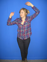
Photographs I have taken for my poster:
When selecting which photos I wanted to use in my finished product, I took several aspects of the image into account, such as the framing, the quality of the image and the lighting of the shot. I also used the photos where the actor was holding the strongest pose, because on my poster I want to represent them as being strong and in control.
Audience Research
To find out the opinions of my target audience on film posters and the way they are presented, I have devised an online poll on my blog to gather their responses.
These images are for use with the poll:
1.
2.
Analysis of results
To the nearest percent, 44% of the voters were male and 55% were female. This means that the ratio of male to female voters were quite evenly spread, making my results fair and from a range of people from both sexes.
100% of the voters who took part in my poll were between the ages of 17-22 years, which is the primary target audience for my three media products. This gives me a good indication as to what sort of features my poster should include to best appeal to my chosen target audience.
On question three, out of a collective total of 26 votes, 9 votes supported that my audience mainly see film posters advertised on public bus shelters. A high proportion of the votes (8) also revealed that my audience regularly see film posters on the sides of buses. This tells we what kind of style of film poster I should be looking to create. Because bus shelters were the most popular place for my voters to view posters for films, I will look to create a product which could be displayed in the same location.
On question four I asked my voters what features of film posters they felt were the most important, allowing them to select multiple choices. The majority of the votes (7 each) showed that the film title and the use of images/photographs were the most important features on the posters to my audience, therefore in my own product I will focus mainly on these aspects. Another feature which they felt was important to show was the names of the actors which would be appearing in the film, so I know to also concentrate on making this information stand out on my own poster. Some people also felt that the use of colour and production information was quite important, however these only scored a couple of votes each so I know that they aren't as important to my target audience as the other features mentioned above. These results are also displayed on the pie chart below:
On the final question I asked voters which style of film poster they preferred, the simpler design or the more complicated one. 55% of the votes showed that my target audience were more drawn to the busier, more complicated poster, which uses a lot of colour and focus on images rather than being dominated by text. This gives me an indication as to what sort of style my own film poster should take to appeal best to my primary target audience.
Sunday, 14 February 2010
Textual Analysis of Existing Products
"Hairspray" Poster
Image source: http://deuvontadededizer.files.wordpress.com/2010/01/hairspray-poster-425.jpg
Opposite is a poster advertising the 2007 film "Hairspray".
The poster uses a range of bright colours against a white background in order to make it very eye-catching. The product is conventional in the way it contains photographs of all of the main stars within the film, however unconventionally it does not couple these with the names of the actors. The way the photos have been taken, revealing only half of the actors' faces, also hides their identity. This style is explained when placed into context with the headline on the poster, "Who's who behind the do?" Here the producers are drawing more attention to the context of the film being set in the 1960's, when big hairstyles were fashionable and revealed a lot about someone's identity, so this is what the photographs mainly focus upon, rather than the actor as a whole.
The actors within the film come from a range of different sexes and age groups, suggesting that the film can be enjoyed by any age group. However most of the actors are teenagers to young adults, which we would expect to be the primary target audience for this musical. Using actors from the same age group as the target audience allows the younger people to identify with the characters in the film. This is one way the poster aims to attract it's target audience.
The tiled effect of showing the photograph makes the poster appear very neat and organised, which is important for this particular kind of medium, because film posters are often only viewed for a few seconds, therefore you do not want them to be over-complicated. The way that each actor is coupled with a different brightly coloured background also makes the poster eye-catching and fun. These colours are mirrored in the films title "Hairspray", which can be found in block capitals at the base of the poster. This repetition of the colour scheme creates an individual identity for the film, whilst the block capitals make the title stand out.
At the very bottom of the poster other information conventionally found on film posters is given, including the film's release date which can be found in the strapline, "Get Ready For Something Big July 20th". The actual date "July 20th" is presented in a bright orange, different from the rest of the strapline, making it stand out further as this would be a very important piece of information for the audience. In a much smaller text, some other conventional information is given regarding the production company information behind th film, followed by the movie's official website, which is highlighted in a bold black font.
"Fame" Poster
Image source: http://www.visualhollywood.com/movies_2009/fame/posters/poster005.jpg
On the left is a poster advertising the 2009 hit re-make of the classic musical "Fame".
Conventionally, the poster is quite simple in it's presentation style. A simple style is usually most effective for film posters as they are typically only viewed for a very short amount of time, for example on the sides of busses or billboards. This particular poster used just one still image of a girl singing into a microphone, which immediately identifies the film's genre as a musical. The use of a bright stage light upon the girl along with the outline of a piano in the background also help to establish the film's genre. The girl shown is an older teenager, and has been styled wearing very fashionable, modern clothing. This style will be attractive to the film's primary target audience of teenagers to young adults, as they will be able to identify themselves with the girl in the photograph. This is one way which the poster aims to address its target audience.
The title of the film, "Fame" has been positioned at the bottom of the poster. The font which has been used for the title is very iconic to this film, as it is the same font that was used in the classic 1980's version of the film, therefore the audience will be able to identify straight away that this film is a re-make of the popular classic. The colour of the font is gold and made up of small shining lights, creating a link with the idea of the bright lights of west end and broadway shows. This further establishes the films genre as a modern musical.
The strapline placed underneath this title, "I'm gonna live forever" is a lyric taken from the well-known song associated with the musical. This further establishes the relationship between the classic version of the film and this re-make. The strapline has been capitalized and coloured in a white font, both of which make it stand out against the dark blackish/blue background.
Other information conventionally found on film posters can be found in a white font at the bottom of the page. This information includes production company details, the movies official website and the pictures release date, "In theatres September 25th".
A Poster of the Film
Image source: http://www.visualhollywood.com/movies_2009/fame/posters/poster006.jpg
To learn more about the conventions of film posters, I have applied the LIIAR model to this form of media.
L anguage – The main idea behind the language of film posters is that the image is the central feature of the product. The text on film posters is typically very minimalistic, usually containing the name of the film, any key actors and the release date. Because film posters are usually very large, too much text would be dominating and off-putting, whereas an effective image will be much more eye-catching and informative.
I nstitution - The main company behind the publication and printing of film posters within the UK is WPP. WPP is the world leader in marketing communications services, and employs over 140,000 people and has over 2,400 offices in 107 different countries. Clients of WPP have direct access to companies with all of the necessary marketing skills to advertise their products. WPP are made up of a number of leading companies in advertising, media investment management, consumer insight, branding and identity promotion, relationship marketing and much more. Amongst these companies are Grey, JWT, Ogilvy & Mather, United Network and Y & R.
I deology – The ideology behind film posters is primarily to advertise the media featured on the poster, capturing maximum attention of passersby through impressive images and uses of colour. However film posters are also responsible for the delivery of information regarding the film’s title, the release date, actors in the film and its production.
A udience – Film posters differ from magazines when it comes to reaching a certain audience. Magazines are generally produced to attract a certain type of person, whereas film posters are seen by the general public on a regular basis on the sides of busses, billboards and shelters. Because such a large audience is being addressed all at once, it is important that film posters are suitable for viewing by all different ethnicities, classes and age groups. The target audience for my film is both males and females (although predominantly females) between the ages of 15 and 22. Therefore my film poster should be extremely attractive to this particular age group, whilst still being suitable and eye-catching to the general public.
R epresentation – The characters who I will be featuring on my film poster will be four main characters which appear in my film trailer. Each actor has adopted a particular persona in my film and I want these traits to be carried across into the still photographs I will be using. For example I will be representing the two females in the same way as I did in my trailer: snobbish and conceited. I will portray them in this way through their body language and facial expressions, possible positioning them with their hands on their hips to represent their cocky attitude. I will also be looking to create a big contrast in the way they are presented against the two male characters in my film, who’s positive passion and determination unites them as a team, rather than being over-competitive like the girls. Again I will be representing them in this way through their facial expressions and body language, possible seen high-fiving or facing each other to show their strong partnership.
Main Product
A film magazine front cover, advertising my film
The photograph which I decided to use on my product is framed as a medium close-up, a conventional frame used on magazine front covers. This framing allows the audience to clearly see the expressions of the people featured on the cover, therefore conveying their emotions to the maximum and creating the desired effect upon the audience. Because one of the key themes behind my film is the idea of competition, I wanted to show this through the ways the characters on my magazine are represented. I decided to have the characters facing back to back, to show their separation and distance, which is also reflected throughout my film trailer. The two male characters in my film are depicted as being ambitious, honest and aspiring, so I had the male character fold his arms and push his shoulders back to reflect his strong personality in my film. The two girls in my film however are represented as being conceited, big-headed, over-confident and constantly degrade the two males, so I had the girl staring at the boy with a look of dislike and disgust.
I chose the name "Epic" for my magazine because I felt it held the right connotations for a film magazine aimed at a young, modern audience, these connotations being excitement and impressive block-buster films. The name is also short, punchy and memorable. To suit the punchy effect the name creates, I decided to use a bold, simplistic font for my masthead, and coloured it in a deep red font again to make it stand-out and eye-catching. I did however decide to introduce some originality to the font in order to create a individual identity for my product. I did this by lowering the bottom of the letter "P" into a sharp point. I believe this sharp edge also hugely suits the name of my magazine, as the word "Epic" is very short, sharp and phonetically contains harsh consonant sounds. The original twist on this letter also makes my magazine look fresh and modern, which would appeal to my primary target audience of teenagers to young adults.
Above the masthead, I also used another feature conventional of magazine covers, a strapline reading "The UK's best film magazine." I capitalized this text and coloured it in a dark purple font to compliment the red of the masthead whilst also creating a contrast between these two features, and also making it stand out against the white background. This feature would appeal to my target audience because if they believe that my magazine is the best, they would be more likely to want to buy it.
In the top right hand corner of my product I also placed another feature conventional of magazines: the issue number. Below the masthead I also gave details of the date my magazine would be released ("December 2009"), one month before the release of my film according to my trailer. Furthermore I included the magazine's website address, as digital media now plays a huge part in the advertisement of print base media. I also showed the price of my magazine on the right hand side below my masthead, which is £2.00. I felt this price would be suitable for a film magazine aimed at young people because it gives the impression that the product is of a certain quality yet is not to expensive for students, who would presumably make up a large proportion of my film's target audience. I also included a barcode for my magazine, which can be found in the conventional place on my product, which is in the bottom right-hand corner of the page.
Magazines conventionally contain plugs and information on any competitions or free gifts the product is offering. Therefore I created a plug which I placed in the bottom left-corner of the page which gives details of a competition to win two tickets to the first showing of the film I have created, called "Believe". I made the plug as a large red circle to create a link with the red in the masthead whilst also making it stand out against my feature photograph. Within the plug I capitalized the words "Win!", "First" and "Believe" and coloured them in a white font so that they had maximum impact against the red background and would catch the attention of my readers.
The main headline on my magazine "This year's biggest musical...Believe." is coloured mainly in a bold, simplistic white font so that it stands out against the photograph behind. I did however choose to colour the word "biggest" in red to create further links with the masthead and establish an identity for my magazine, and also I typed it in a slightly larger sized font to even further emphasise the fictional popularity of my created film. As is conventional of film magazines, I did not use the actual logo for my film on the cover. However the font I used on the word "Believe" is very similar to that of my logo. I also coloured the title in gold with a slight white shadow. The font creates a tangible link with my other products because it is so much like the font used on the logo for my film. The logo on my poster will also be coloured in a gold font, so this creates another stylistic link. The colour gold also connotes status and glamour, two themes often associated with big musicals.
The photograph which I decided to use on my product is framed as a medium close-up, a conventional frame used on magazine front covers. This framing allows the audience to clearly see the expressions of the people featured on the cover, therefore conveying their emotions to the maximum and creating the desired effect upon the audience. Because one of the key themes behind my film is the idea of competition, I wanted to show this through the ways the characters on my magazine are represented. I decided to have the characters facing back to back, to show their separation and distance, which is also reflected throughout my film trailer. The two male characters in my film are depicted as being ambitious, honest and aspiring, so I had the male character fold his arms and push his shoulders back to reflect his strong personality in my film. The two girls in my film however are represented as being conceited, big-headed, over-confident and constantly degrade the two males, so I had the girl staring at the boy with a look of dislike and disgust.
I chose the name "Epic" for my magazine because I felt it held the right connotations for a film magazine aimed at a young, modern audience, these connotations being excitement and impressive block-buster films. The name is also short, punchy and memorable. To suit the punchy effect the name creates, I decided to use a bold, simplistic font for my masthead, and coloured it in a deep red font again to make it stand-out and eye-catching. I did however decide to introduce some originality to the font in order to create a individual identity for my product. I did this by lowering the bottom of the letter "P" into a sharp point. I believe this sharp edge also hugely suits the name of my magazine, as the word "Epic" is very short, sharp and phonetically contains harsh consonant sounds. The original twist on this letter also makes my magazine look fresh and modern, which would appeal to my primary target audience of teenagers to young adults.
Above the masthead, I also used another feature conventional of magazine covers, a strapline reading "The UK's best film magazine." I capitalized this text and coloured it in a dark purple font to compliment the red of the masthead whilst also creating a contrast between these two features, and also making it stand out against the white background. This feature would appeal to my target audience because if they believe that my magazine is the best, they would be more likely to want to buy it.
In the top right hand corner of my product I also placed another feature conventional of magazines: the issue number. Below the masthead I also gave details of the date my magazine would be released ("December 2009"), one month before the release of my film according to my trailer. Furthermore I included the magazine's website address, as digital media now plays a huge part in the advertisement of print base media. I also showed the price of my magazine on the right hand side below my masthead, which is £2.00. I felt this price would be suitable for a film magazine aimed at young people because it gives the impression that the product is of a certain quality yet is not to expensive for students, who would presumably make up a large proportion of my film's target audience. I also included a barcode for my magazine, which can be found in the conventional place on my product, which is in the bottom right-hand corner of the page.
Magazines conventionally contain plugs and information on any competitions or free gifts the product is offering. Therefore I created a plug which I placed in the bottom left-corner of the page which gives details of a competition to win two tickets to the first showing of the film I have created, called "Believe". I made the plug as a large red circle to create a link with the red in the masthead whilst also making it stand out against my feature photograph. Within the plug I capitalized the words "Win!", "First" and "Believe" and coloured them in a white font so that they had maximum impact against the red background and would catch the attention of my readers.
The main headline on my magazine "This year's biggest musical...Believe." is coloured mainly in a bold, simplistic white font so that it stands out against the photograph behind. I did however choose to colour the word "biggest" in red to create further links with the masthead and establish an identity for my magazine, and also I typed it in a slightly larger sized font to even further emphasise the fictional popularity of my created film. As is conventional of film magazines, I did not use the actual logo for my film on the cover. However the font I used on the word "Believe" is very similar to that of my logo. I also coloured the title in gold with a slight white shadow. The font creates a tangible link with my other products because it is so much like the font used on the logo for my film. The logo on my poster will also be coloured in a gold font, so this creates another stylistic link. The colour gold also connotes status and glamour, two themes often associated with big musicals.
Friday, 12 February 2010
Drafts
Before I can go on to create my final product, it is important to create a variety of different drafts of the layout and experiment with colour schemes, fonts and feature photographs which I want to use on the front cover to ensure that I create the best text possible.
Font for my magazine masthead
I chose to use the final font (Segoe UI Semibond) for the masthead of my magazine cover because I feel that it is the most clear to read, as the other fonts seem too artistic for a magazine cover and could be difficult to read from a distance. The clear, bold font also suits the punchiness of the name of my magazine, "Epic".
Drafts for my magazine front cover
Photographs I have taken for my front cover:
Once I had chosen which image I wanted to use on my magazine front cover from the selection I had taken, I used "Microsoft Picture It!" to edit out the blue screen background and adjust the brightness/contrast of the image. I chose to use this particular image because I felt that the focus was very clear so the image is of a good quality. I also like the way the shot is framed, as both of the characters expressions can clearly be seen.
Subscribe to:
Posts (Atom)